Loading cart contents...

This collection explores what Hamide means to us and to you through the design of an H letter.
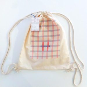
Ekose
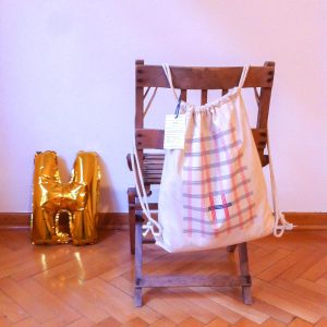
Hamide Yanç Özçetin designed various number of bags in a variety of designs throughout her career. Especially, shopping bags were really important due to environmental reasons. She was against over-consumption, single use products, or products damaging the environment. She was extremely careful about her use of plastic bags and packaes. She respected so much to the work behind products, materials, and resources. Moreover, she also cared about creating good and decent experiences. That’s why textile shopping bags were one of her signature products and that’s why we decided on this product type for the 2019 edition of “H for Hamide” collection, through which we explore the values of Hamide.
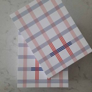
The design reflects Hamide’s minimalism, geometric and structural attitude, which were all Hamide’s design characteristics. As we were exploring the letter H, we realized that it is formed by two vertical and one horizontal lines crossing and intersecting with 90 degrees giving this feeling of continuity in both directions. This feature was a perfect opportunity to create an “ekose”(checker) pattern, which we have always admired. A section of the intersecting lines were defined to reveal the “H” and the source of the ekose pattern.


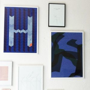
2017 Edition
In 2017 edition of “H for Hamide” collection, designers Zine Yolal and Maja Østergaard Nielsen were introduced to Hamide, the story behind the studio as well as the values of the studio which take their essence from the honorary founder Hamide Yanç Özçetin. Alongside Seda Özçetin, they were asked to interpret the values as sustainability, openness, humanism, minimalism, etc through typography and specifically with design of an “H” letter.


Patchwork 1 by Seda Özçetin (Hamide)
“My mom Hamide would finish her each project by going through its leftover fabrics. She would cut the ones big enough into “baklava” shapes while the others would be cut into threads to be used as yarn. We had piles of these leftovers, which I found a bit frustrating as a kid because they would take over the already not existing personal space in our very small apartment. Yet, I would love to go through them with her, when she once in a while opened them to create a patchwork. It was not only a trip down our personal memory lane but also textile design’s. I loved how she combined them together addressing the diversity they held creating a harmony with touches of absurdity. With this work, I aimed to remember this memory and her unique nature that welcomes and enjoys diversity. The repetitive forms as well as the color scheme are thought as a reference to her eastern background, the ceramic tiles in mosques which she adored.” says Seda Özçetin.


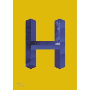
Constructive by Zine Yolal
“As a part of my master project Kultur x Kultur from Designskolen Kolding I collaborated with Hamide Design Studio. They were the best support and mentors I could ask for while working with the complexity of developing new solutions for young dash-Danes. Now they asked me to design two posters for their new collection H for Hamide. In my worked I were inspired of their values as people and design studio. Constructive is inspired by the Nordic design traditions showed through simplicity and geometry in shapes and composition. The colors of the poster were found in the mood of the Middle East; especially Turkey.” says Zine Yolal


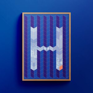
Glitched Layers by Zine Yolal
“Before I started my work for Hamide Design Studio, the daughters of Hamide told me about her last days and all the discriminating issues they had to face during the time. Glitched Layers is inspired by the layers of Hamide’s life in different levels — culturally, physically and mentally. Even though life always moves forward, forward doesn’t always mean straight ahead.” says Zine Yolal.


Mix It Up by Maja Østergaard Nielsen
“I was invited by the daughters of Hamide to interpret their values with inspiration in their designs and stories about their mother and honorary co-founder Hamide Yanç Özçetin. In the many stories and design values I found a big openness and room for differences which I wanted to translate through my own visual language. The H thereby formed a space for me to represent difference and at the same time connection through the means of textural surfaces in different spaces. ” says Maja Østergaard Nielsen.


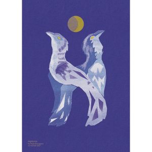
Nightbirds by Maja Østergaard Nielsen
“Through the stories shared with me by the sisters Seda and Seyda, there was especially one which gave me and understanding of Hamide Design Studio’s story and foundation. Hamide Yanç Özçetin used to describe her daughters as night birds, as they would always be up all night doing all kinds of projects. They continued to do that, but now under the name Hamide design studio. My design is thus inspired by the idea of the two night birds with the freedom and mystic I think is in the stories of Hamide design studio.” says Maja Østergaard Nielsen.
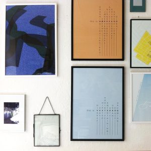
Shop the Collection
-

 8.000,00 kr.
 -


-
Sale!
 Original price was: 380,00 kr..300,00 kr.Current price is: 300,00 kr..
 -

-

-
-
Sale!

 Original price was: 30,00 kr..25,00 kr.Current price is: 25,00 kr..
 -


-